Monday, August 22, 2016

Calendaring...like journaling, but on a refrigerator

I have seen many cute ideas for journals but I'm a calendar girl. Wait....anyone hearing Neil Sedaka singing? No?  Well, I was too young for good ole Neil in 1960 when that song was recorded and I have never been the pin up calendar type. When I say I'm a calendar girl, I mean my refrigerator is Mission Control with everything important entered on the calendar that hangs on the freezer door. Recurring events and appointments also go in my iPhone, but after decades of looking to the fridge for guidance, the habit is not likely to be broken now.

Hmmmm, looking to the fridge for guidance may have led to my weight issues but that is a different story entirely!

A few years ago I had a calendar kit from a store that no longer exists in brick and mortar reality. That calendar was a mix of colors, textures, photos and anything you could think to add to a page. The problem was the thickness of the completed project. It could never go on the fridge. All of the layered embellishments meant the pages stood away from the door at nearly a 45 degree angle. Forget ever scribbling a note on a calendar page with a phone in the crook of your neck. That calendar languished on my desk, occasionally looked at but never really used.

I bought a Cambridge calendar by Mead at Target. The overall size is listed at 14 7/8 inches by 11 7/8 inches. The individual dated boxes are 1 7/8" square. One plus to this calendar is that the squares are roomy for writing in appointments and there aren't pictures in any of the squares or decorating a border. This is good for self expression. A negative is that the paper is very thin. I'm lucky that the first page I decorated did not bleed through to the underlying month. I'm now using cardboard between pages as I stamp and color them. This calendar runs from June 2016 through June 2017. I thought it was an 18 month calendar when I bought it and didn't realize this until I had already started decorating. Oh well.....

I began with September, a month with a few family birthdays and anniversaries. The first attempt at stamping "Happy Birthday" directly onto the calendar page did not go well. I'm blaming it on the stamp being brand new and the ink not covering well. Starting out with a mistake freed me from the pressure of perfection. This was going to be a functional calendar with some fun and color in it, not a museum worthy piece of art!

The fifth is my wedding anniversary. I started out stamping the word anniversary and the heart from a BoBunny collection called Icons.  This was too small to suit me. I added the cactus, pot and sentiment from My Favorite things Sweet Succulents and colored them with Prismacolor pencils.
Yours truly has a birthday next month. The leaf is a leftover from a project that hasn't been finished yet. Since the 22nd is the first day of autumn, it seemed appropriate to stick it here. For the record, I was born in the early hours of the day when it was still summer. Summer is my favorite season. Fall would be okay if it didn't lead to you-know-what. The sentiment about treating me like a queen is from an Art Impressions set called The Queen.
October has a few good things going for it, including my son and daughter-in-law's anniversary; the anniversary of dear friends on the 14th (that greeting in blue is part of an anniversary set by the Stamps of Life); a night out with friends to see Jeanne Robertson; and Halloween. The dazzling damsels represent my once a month dinner buddies. Our initials are T, L and C. We were meant to be together, right?  This stamp set is Flaunt It by Art Impressions. The markers used are Zig Clear Color markers. 
Halloween is a big event for me and could have its own page if I had designed the calendar but alas, October is one of those months where a few dates share a space and Halloween got shortened. The word Boo and the bat are from Inky Antics Creepy Crew. The Jack O'Lantern is an orange marker from Zig but I didn't want to do the bat in black and lose the detail. I used Prismacolor pencils, first a layer of chartreuse, then Warm Gray 90%, and finally a layer of Slate Gray. I have no idea why I chose those colors other than experimenting on something like this is fun. There isn't going to be a "wrong" and if it went really badly, I would have stamped another image, colored it, cut it out and glued it in place. Everything in life should be so easy!
November is saved from doldrums by Thanksgiving and my sweet daughter-in-law's birthday. Sometimes that order changes since turkey-fest changes dates. The turkey stamp is Gobble, Gobble by Your Next stamp. The cupcake is one cupcake cut from an image of 6 cupcakes on a tiered stand, Cupcake Greetings by Sizzix.
December has a few more birthdays and of course, the jolly old guy who arrives at the end of the month. The stamp I used is Jolly Santa by Woodware Clear Magic Singles. His image prints with a solid square border. I wiped off some of the ink before stamping but not all of that border. I added the two ornaments to cover areas that were too visible to ignore but not visible enough to look like anything. The ornaments are from Clearly Besotted Laugh Out Loud: Christmas. The ornaments and the red hat are Zig markers, the face, facial hair and skin are colored pencil. The facial hair has a light base coat of cool gray pencil, the fur on the hat has warm gray. Over both I used white Signo Ball pen, done in squiggly lines to represent fur and hair. The silver dots on the purple ornament at the hanging device of each ornament was done with a silver pen, also Signo brand. The lens of Santa's glasses have very light blue coloring (pencil) under a coat of clear gel pen (Glaze) by Sakura. 
Appointments are being added in plain pencil as we all know they sometimes change. I have numerous markers and many aren't used often as I forget about them. I have a database of my stamps, dies and punches. Don't roll your eyes....I like data bases. I have binders with photos of my stamps. This is easier for me to flip through when I'm trying to decide what birthday image to use for a card or wondering if any set has elongated star or a perfect sentiment that I might want to emboss rather than write by hand. 

I'm having fun doing this. Let's face it, most of us aren't going to save the world in a dramatic way, but we can enjoy ourselves and spread cheer with what we do. Some of us plant beautiful flowers (I have a black thumb and it isn't from ink!). Some of us cook magnificently.  I can bake sweets like nobody's business but try to avoid that since being successful on Weight Watchers. Some of us sing so beautifully, people would pay to hear us. People would pay me to remain quiet. 

If I'm creating something to share, I am hopefully bringing a smile to two people, the recipient and myself. If I am creating something for me, I am happy in my own little world where the ugliness that all too often fills the news is kept at bay. To quote Martha Stewart, it's a good thing. 

Saturday, August 20, 2016

A dark Copic background; Darcie stamps and buttons

Whenever I use directions or closely follow an example given elsewhere, I try to credit the source. Life has been full of distractions lately and craft time has been more fractured than usual. I include blog reading and Pinterest viewing as part of my craft time. I thought I had pinned the directions for creating the dark background I am about to describe, but I did not. I'm sure this isn't an exclusive lesson or formula, but I do want to be clear that I didn't come up with this on my own and apologize for not being able to name my source.

This play time began with Copic markers, X-Press It paper, and a few Signo pens. I began with B99, Agate. I used the chisel tip of the marker to color a base coat. I didn't think to take photos of each step but I don't think they are truly necessary. After that base color, I used the brush tip of B69, Stratospheric Blue, over everything. The goal wasn't a streak free blend, this was an experiment and may have resulted in a night sky if I liked the result.
Perhaps not many people have any of the fluorescent Copic colors, but I have a few of them, including FB2 (Fluorescent Dull Blue) and FBG2 (Fluorescent Dull Blue-Green). I would not have thought to use them in this application, but those markers were good for lightening areas of the dark background. I believe these qualify as Super Eaters. This first photo has FB2 in random cloud-like circles.
In this photo, I've added clouds of FBG2 and some dark patches of 100 (Black), and then gone over everything with B69 again.
I wanted to reclaim some of the lighter areas so I used FB2 again.
Now for some colorless blender. The plan was to pour a bit into my palm and flick drops onto the paper. Reality happens. In common vernacular, that would be shit happens and the small mister bottle of colorless blender that I was using spilled. Not once mind you, but twice. That takes a special kind of talent to repeat the same mistake twice in ten seconds.
This is what the back side of the paper looks like. The large blobs are the colorless blender spills. The top one is the long arm of the law (or perhaps a hungry dinosaur?) coming in to pat (or eat?) the profile of Jimmy Durante. Please tell me someone else is old enough to know who he was. if you are too young to know who he was, think of Gru from the Minion movies.
In this photo I've added some dots of white Signo pen and some of silver. I also dripped and misted additional colorless blender. Now I needed to decide what to do with this.
I attended a scrapbooking expo months ago and purchased stamps and tin pins from a company that was new to me. The company is Darcie Heater Designs. Here is a link to stamp that I used Frankly Stamps, and here is a link to the coordinating tin pins Frankly Embellishments.  I decided to cut this down and use it as background on a card with Franky and his bride stamped, colored, fussy cut and glued in place. 

Before adhering anything, I thought I would try embossing some spider webs with a stamp from Inka Dinka Doo and some glow in the dark embossing powder. That didn't work. Either my Versa Mark isn't moist enough or the grainy embossing powder was too heavy for the fine lines of the webs. I heat set the Versa Mark, then re-stamped the webs with silver ink. 
Here is the background, mounted on sparkly silver paper and then onto a black card base. The words Happy Halloween are from a Stampin' Up's Teeny Tiny Wishes.
I colored the faces in to resemble the tin pins. The ghost (an old rubber on wood stamp) was stamped on vellum and colored first with Copic markers and then Prisma Color pencils. Accidents continued....I put glue on the "wrong" side of the ghost. Technically there isn't a right or wrong side I guess, but the pencil strokes looked better on the underside. I wiped off the glue and added some to the back side.
Here is the finished card front with the tin pins in place, held with glue dots. 
I don't know if I will use the card as is or if I will repeat this with a little more care before Halloween. 

There are two more sets of each face in the tin pin package. I think the bodies stamped and  cut out in a sturdier shape (not fussy cut) with magnets on the back might be cute on the refrigerator this Halloween, something sturdy enough for the grandkids to play with as long as I make things secure enough for Princess of Sparkle who will be almost 18 months old at Halloween. 

Tuesday, August 9, 2016

Dragonflies and Anniversaries

Two recent die purchases were this Dragonfly die set from Technique Tuesday and the words Happy Anniversary from Tonic Studios:
      
Anniversary greetings, both stamps and dies, aren't as prevalent as birthday greetings which I understand. There are more occasions to give birthday cards than anniversaries. Throw in personal tastes and the choices becomes even more limited. The dragonflies certainly won't be limited to anniversary cards, this is just their debut from my craft room. That Tonic Studio die of Happy Anniversary is going to get a lot of use. I really like the style and size. 
I began with the top two cards. they were going to identical but they didn't turn out that way. The dragonfly base and the lacy overlay are matched pairs on each card rather than one with yellow lace and one with coral lace on each. Matched pairs seemed less busy.  
The rather nondescript background blobs are bits of glow in the dark glitter. That came about when some accidental glue smears were way too noticeable, despite being clear. It doesn't show well in these photos against the black surface, but the blue cardstock has a white mat and is mounted onto a light green card base. The card interiors have a white area for the greeting with three small hearts cut from the blue paper adhered along the lower left edge. 

The purple card used up my last scrap of butterfly paper, a small print on black from Stampin' Up. The base dragonflies, the greeting and the mat between the blue paper and white card base are from Stampin' Up, the color is Wisteria Wonder. I outlined the greeting with a white Signo pen and added dashes to mark the flight of these dragonflies. 

Cat Lady Birthday card

I have a friend who isn't necessarily the Crazy Cat Lady but she does have cats and she is a little crazy. She has Corgis too. Does that make her crazier or balance some of the cat craziness? This is too deep for me to contemplate.

I used Copic Markers and Art Impressions Crazy Cat Lady stamps to create this card.


The colors, both Copic and cardstock, look better in person. How my camera zeroes on stroke marks (less obvious in reality) and yet distorts color is beyond me. I should take all photos outside but that is not practical.

Oh well, you are getting what you pay for...this blog is free to read! 

Thursday, August 4, 2016

Sun Art

Sun*Art...fun for ages 6+.  I am well past 6 but I do like to have fun! Cyanotype paper is a light-sensitive coated paper that reacts when in the sun. It only takes a few minutes to react in strong sunlight, you remove your stencil or objects placed on top, rinse it in water and let the paper dry. 

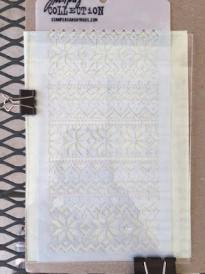
First I tried a stencil. This is a sheet of cardboard with the Sun Paper, a stencil and an acrylic sheet over it, sandwiched in binder clips before taking it outside. The acrylic sheet came with the paper packet.

 Here we are after a scant two minutes in the sun. 

Same time frame, but this photo was taken under an awning to show how pale everything looked before rinsing in water. 

Ooh, this is interesting....

Uh-oh, not looking like much wet!

And here we see it darkening as it dries. 

Don't worry about the wrinkles. First of all, this is all experimental, but the paper is thin and should flatten when weighted under books for a day or two. 

I was going to try some natural elements but everything that should be green and growing is parched. The dry weeds that I might have tried just didn't look interesting. While searching for something else it clouded over, thundered and rained. Sadly, the rain lasted less than 10 minutes.

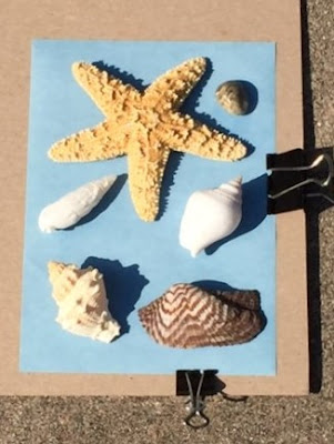
Before getting busy with dinner, I eyed the shells in a centerpiece and made this arrangement.

Again, roughly two minutes had the blue paper looking white. I didn't use the acrylic sheet with this due to the dimensions of the shells. I think the sheet is just to keep lightweight objects from blowing around. Because it was later in the day, the sun was on angle and the shells had some interesting shadows.

The irregularities of the shells weren't as distinct as I had hoped when I removed them from the paper before rinsing. 

I like the starfish but the others are rather indistinct. 

I've read that adding lemon juice to the rinse can change the outcome but don't know if it needs to be fresh or if bottled juice will work. Trying that and other objects such as hardware and sewing notions will have to wait for another day.

Hello Chum....

Hey Chum....another birthday?

Using Avery Elle's Hello Chum stamps on X-Press It paper, I colored the shark, water, small fish and seaweed with Copic markers. I stamped the image with tuxedo black Memento Ink and also used that on the sentiment and fishing rod on the front of the card.

This isn't my best effort and certainly not my best photo capture. Life has been hectic lately and I was pressed for time to get this done and into the mail.