Monday, October 24, 2016

Hershey Nugget boxes

I wanted to express thanks to a group of people, a simple acknowledgment of their cheery attitude and efficient manner. These boxes were made to accompany my thank you greeting. I made two dozen of them so that everyone would have a small token of my appreciation.

There are many directions available online for presentations of Hershey Nuggets (or Nestles Treasures) but most of the boxes weren't a size that pleased me. Some designed to hold three candies were rather wide and long for three but certainly not large enough for four. I tweaked various directions to come up with dimensions that worked for me.

First off, here is a plate of my boxes. Each one slides open (the top is a sleeve) to reveal three candies.
Here are the boxes, uncovered, with candies inside:

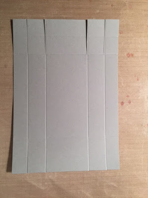
Each box began as a 5 1/4" by 3 3/4" rectangle. With the paper in landscape orientation on my scoring device, lines were scored at 1/2"; 1 1/8"; 4 1/8"; and 4 3/4". Turning the paper to portrait orientation, I scored it 1/2";  1 1/8"; 2 5/8"; and 3 1/4".  Still in this position, each of the vertical lines were cut from the outer edge to the second horizontal line, top and bottom respectively. Here is the top cut, bottom untouched.
Next you will remove excess paper from the corners of the boxes. The walls will be folded inward onto themselves, making the box sturdier. I am a visual person, so looking at this is explanation enough for me. To explain in words what I've done, I removed the smaller corner squares first, then one small square on either side of that along both edges.
Here is the box with all of the corners cut away:
My next step is something I learned to do a while ago that makes assembling corners much easier. What I've done here is trim the sharp corner on each of the tabs. This photo shows the left side done, the right untouched.
Here is the box completely trimmed on black paper. 
Creasing each fold line, this is now beginning to look like a box.
It doesn't photograph well, but I on the bottom of the box (mountain rather than valley fold lines) I put adhesive on the four small flaps that would fold inward to begin box shaping.
On the inside of the box, adhesive was added to the four rectangular areas.
I know it looks like I've skipped photographing a step, but in reality, I just didn't have another pair of hands to hold the box while taking a photo. In the beginning, I glued the small flaps to the inside (the short ends of the box), then added a swipe of adhesive and folded the outer end  inside to finish the short ends, then repeated with the long sides.
After making a few this way, I got a rhythm going and applied all the adhesive (both inner and outer sides) and assembled the box quickly and easily.

The rest of the box is a sleeve, and is very simple to make. Begin with 5" x 3" rectangle. With the long side across the top (landscape orientation), score at 5/8";  2 1/4"; 2 7/8"; and 4 1/2". Those two end flaps are not quite the same dimension. The first one is 5/8" wide, the other end is 1/2". If that bothers you, you could cut the rectangles at 5 1/8" and both flaps would be the same size. My measurement allowed me to put the adhesive on the outer (print) side of the 1/2" flap and have the wider side cover it. By that, I mean that the 3" edge of the first flap (5/8") covers the smaller flap and meets at the crease. Sometimes, if both sides are cut supposedly the same size but are a bit off or are creased a little catty-wampus, you have a problem.

I had a lot of fun making and decorating these boxes and will undoubtedly make them again.


Quality supplies or bargain bin purchases?

It isn't always obvious and easy to choose between similar looking products that vary in price. Sometimes the intended project merits a greater investment, other times you'll want to get away as inexpensively as possible. As a knitter, I know the difference between a quality yarn and something that is unbelievably inexpensive. I'm not naming brands nor am I shaming anyone in their choices. I mention this just as something to think about. There are good yarns that are not terribly expensive. They handle beautifully, they feel good in your hands while knitting, and they wash and wear well. 

The same is true with fabric. A mill may make a similar fabric that is sold in the large, chain craft stores as what they sell in quilt shops, but the threads themselves, along with the dyes and thread count will be different which will affect the same issues: handling, the feel of the finished garment and how well it washes and wears. Experience, if not trusted advice, will show you when to invest in the costlier supplies. I once made a beautiful dress that looked good until it was washed. My bargain fabric did not hold up at all and the dress was never worn again.

My most current lesson on value concerns paper. I had a Stampin' Up die (Home Sweet Home) to use to make a cute little house which was going to hold candy. I wanted the house to be gray but I did not have any Stampin' Up gray paper, nor any other brand of similar quality. I'm not speaking of truly thick paper, just something with decent body. I did have gray paper in a multi-pack of grays and blacks from Joanns and thought that would be okay. 

Isn't this cute? The black door has a stamped ghost but out vellum greeting visitors. There is a spiderweb, also vellum, on the front and back. The light in the windows is a shiny gold paper behind the black window panes that were die cut.
Here are the sides and back of the house:
  
I left glue off of one side of the roof so that it would open for candy.
So what is the problem with this gray paper? If you look at the above images closely, you might already see it. The paper is so thin, the scored lines which were made when running it through the die cutter (a Sizzix Big Shot), are splitting open.
Live and learn. And don't forget to add gray paper to my Stampin' Up shopping list!

Monday, October 10, 2016

An anniversary card

Someone very special had an anniversary this past weekend. This is the card I made for them.
First, the uncolored image in a sample placement. The stamped image is from Birds and Bells, by Honey Pops for Inky Antics
The honeycomb paper was cut larger than the stamped image included in this set to form a bell.
The paper used in the background was an odd bit I've had forever. Inside, the strip of this paper on the left was actually a pocket that could hold cash, a check or a gift card.
I colored the bell and ribbons with various markers and then added Glossy Accents and Wink of Stella which unfortunately don't show in the photograph.

My summer top...finished for fall

Back in May, armed with the Spring 2016 issue of Creative Knitting, I bought Cleo yarn by Plymouth to make the Mandarin Tango Tee. I didn't plan to make it exactly as shown color-wise but the color selection where I shopped led to choosing orange yarn. I was going to have it finished by the end of June to wear to an outdoor wedding celebration with a fiesta theme.
For a variety of reasons, I didn't get it done in time for the party, then other events and projects got in the way of completing this even though I really liked it and enjoy working with this yarn. Finally, it has been finished and was worn this weekend over a white turtleneck instead of over a white tank top. 
I asked my husband to take a photo and focus on the top. He cut my head off.
 When I complained about the decapitated photo, he caught me smirking. I give up!
A selfie close up. This is unblocked but I think it looked okay as is. I will wear it a few times this fall and look forward to wearing next summer as originally planned over tank tops.