Showing posts with label Vanilla Arts. Show all posts

Thursday, April 27, 2023

Amy Shulke and Vanilla Arts

What has brought me out of the darkness of no blog posts in over a year? Finding a favorite instructor on YouTube and hoping to help her build her channel. I almost quit trying to do anything with alcohol markers many years ago after lousy experiences with supposedly "Copic-certified" instructors. Then I found Amy Shulke teaching at a private store and was instantly hooked on Copics and Prismacolor pencils. 

All of the work in this post is from early 2015 to mid-2016. Personal events in my life interfered with continuing and by the time I was ready to resume, the pandemic had changed everyone's life. To see what Amy might bring to your coloring experience, please check out Amy's YouTube Channel.  

Here are my results from those classes years ago. I still use the techniques and apply them to my cardmaker projects. 


Friday, July 29, 2016

Copic Cupcake

The best kind of cupcake when you're trying to lose weight is one done on paper that is just too cute to eat if it were real.

Okay.....I would totally eat this cupcake but that is another story and episode for True Confessions.


The image was drawn by Amy of Vanilla Arts and done in a class held at Remember When? Scrapbooking. If you are near Macomb, MI, check out the store. Whether you are or not, check out both businesses on Facebook. Amy has dome classes available online.

I didn't create the Copic or Prismacolor combinations used so they aren't mine to share. I will say to those of you using Copics and nothing else, don't be afraid to use colored pencils to fine tune your images. Pencils can add and correct details. Their fine points versus the wider tip of a marker can turn  something good into something great.

Happy coloring!!

Tuesday, July 19, 2016

Dragon with a sparkly tummy

I seem to love whimsy more than realism and that isn't just because this is an election year.

When coloring a dragon, realism is not a concern even though most of us go for green, right? I have a puppet named Smolder from the Melissa and Doug company that is green and we (meaning my grandchildren and I) love him. His voice and speech pattern are a cross between Kermit and Yoda who coincidentally are both green.
Last week's Copic Class by Vanilla Arts and held at Remember When? Scrapbooking (that is a link to the store's Facebook page) used a stamp called Ducky Fun by C.C. Designs.
One day I will get better about taking photos indoors and get the lightly under control so that colors photograph more accurately. Until then, take my word that this guy is seriously cute.
I added Glossy Accents to his eyes. Don't worry about them looking lumpy here, it is the angle of the shot. Guess that is something else that needs work.
The color is more accurate in this photo but this shot didn't really fully show what I was trying to illustrate, that being the Wink of Stella used on his tummy and throat.

I will definitely color this image again and probably vary from the traditional green.


Wednesday, July 6, 2016

Watercolor tulips, why to frame them

When you comb your hair, perhaps apply mascara and lipstick if you are a woman who looks washed out without those items, stand up straight and adjust your clothing so that you look neat, you look better to the world at large. You don't do this just for the world, you do it for yourself because you feel better when you look in the mirror or in the faces of the public as they acknowledge you.

When it comes to your art or craft projects, finish them and put them in the setting in which they'll be used. Finish the item for a card or at least put it safely away for when you are going to assemble a card later. If you've painted something and perhaps are feeling so-so about, put it in a frame or at least behind a mat. Wow....it suddenly looks more important and presentable, right?


The frames I've been using are the least expensive I could find. The glass pops out from the top side of this plastic frame. If you aren't aware, watercolors need to be matted so that the painted surface does not rest directly on the glass. Normal moisture that affects everything in a room (humidity) could cause the paint to smudge and run if against glass. 

When my family room is repainted, a ledge is going to be placed on one long wall where my art projects will sit. Currently a few pieces from long ago are hanging on that wall but with the number of classes I've been taking lately, the number of holes I'd be placing in that wall would get a little crazy. Besides, I like to rearrange things so shuffling the order of what is on display will please me and encourage me to keep trying to improve my techniques.

I've learned that there is always going to be room for improvement in my work, but it is okay to enjoy things as they are. This coincides with my weight loss journey which hasn't made much progress lately, but I'm definitely enjoying the progress I've made and dare I say...even proud of my accomplishments. Same with this botanical series of watercolor classes. 

Mother Nature will always best me in beauty but this isn't a contest. This is fun. 

Monday, June 20, 2016

Stop worrying and make something!

Sometimes the fear of not doing something well prevents us from even trying. Isn't that silly? Unless you're about to try sky diving without a parachute, you are probably not going to hurt yourself in an attempt to do something artistic or crafty.

I know this and still sometimes put up emotional obstacles. I was doing that again recently until my inner voice told the outer me to stop this and just make something! I'm not looking to sell my work so there isn't the stress of public acceptance. I'm not expecting anything I make to hang in a museum. My goal is to learn and to have fun, so why was I beating myself up?

There are long answers, short answers, unrelated answers and no answers. The good news is that I am done with that again, hopefully for a long while. When the inner voice reminded me that I'm not in competition with Mother Nature, my instructor or the people on either side of me, I knew that was right and calmed down and enjoyed creating again.

Here is my proof:
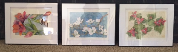
Amaryllis

Dogwood

Trillium

These are all class assignments with one more that needs to be restarted. Botanicals scare the heck out of me. Isn't that silly? I can't keep a plant alive but that shouldn't apply to painted plants.

There is something in each picture that I really like and at least one thing that causes me to wince in each, but overall, I am happy and plan to frame each one.

I would like to say that I'll return to these images and paint them again, starting over fresh, but honestly. I have so many things that I want to create, that might not happen.  The objectives of each class will hopefully stick with me and allow me to merrily flit from one project to the next.

Edited to add: Here is a photo of them framed. By framing standards, these are not expensive, but they are matted, under glass and were sprayed with a sealant the day before framing.

Sunday, June 5, 2016

Copic reds

Ahhh, red....I love red!  I love Copic markers too but sometimes have trouble finding the right red or combinations of reds and other colors (highlights and shadows) to create something realistic. Thanks to classes, I'm learning. 

This class was taught last month at Remember When? Scrapbooking by Amy (Vanilla Arts Co) based on a Penny Black stamp with a wooden fence/paneled wall background. This is a beginner level class in Copic Club. 
This teacup full of strawberries was also taught by Amy at the same shop last month. The strawberries are even more amazing seen up close.  This is part of the Advanced Coloring class taught monthly. Advanced doesn't mean more difficult, it simply means you have a working knowledge of how to use the markers, how to get them to blend and have (or are willing to purchase) more markers to achieve the desired affect. 
Part of the secret to these successes is using a bit of Prismacolor pencil after the Copic coloring is done. The strawberry image is not quite finished in the above photo but I am having trouble with iCloud for Windows. The photo is in there, but I can't access it on my PC to bring it here. The only thing missing are some shadows and a line indicating a table edge in the background.

For information on live or online classes with Amy, click on Vanilla Arts  or look for Remember When? Scrapbook Store and Vanilla Arts Company on Facebook.

Friday, April 29, 2016

Embossing texture paste

This month's Mad Scientist Lab was about texture pastes and mediums.  What a fun excuse to get messy hands!

Some of our samples began with gesso, others with gel medium. Do you have supplies that you bought for a specific project but never learned how else to use them or how one product differs from another? This class was extremely helpful.

Some of my samples were completed in class and some were finished at home with additional or different touches due to availability of what I had at home. I didn't think I would like the image transfer (the raspberry photo) but the more I look at it (especially in person), the more I think I might use this procedure again.
I like both of these, especially the one on the left. That was a heavy texture paste dried, then spritzed with glycerin and water to hold silver embossing powder. I know I will repeat that technique. I have Wow embossing powder in silver that I really like.
This one was probably the biggest surprise of all to me. It has a bit of everything going on and to be honest, there is no pattern or flow to my sample, but that is okay. The manila paper was textured in areas with a stencil and texture medium. There are gold smears along with a clear medium that had fine glass beads in it. Oddest of all for me was the mix of paper flowers, metal findings, buttons and rhinestones.
I didn't take a photo of the piece as it came home from class. Areas were still drying and I wasn't sure I was ever going to like it. From past experience, I knew to keep on going with additional embellishments. Either the corner would be turned and I would like it, or I would be certain of what I wouldn't repeat.

The above photo was taken indoors on a cloudy day. The gold looks dark and rather flat in color. The rhinestones and other dimensionals don't really show the spritzes of gold, pearl and pink that I lightly layered over areas.

The two photos below were taken outside and the shimmer is now visible.

This piece is definitely a practice piece and won't become something else, but the process led to the mixed media clipboard project (here) which I really enjoyed.

Don't fall into the rut I was in. Experiment with what you already own and use some of your least favorite embellishments and papers. If your experiment works, hooray! If you hate it, you're not out anything but some time since you weren't using those supplies anyway, at least not in all the ways they might be applied.

Have fun!

Monday, March 28, 2016

'Twas the day after Easter...

'Twas the day after Easter
and isn't it funny
my deadline is gone
for making a bunny

The Easter decor is packed
in boxes and a bin
Now what to put out?
Let creating begin!

(apologies to Clement Clarke Moore)

Here is a view of my Easter table. That's a lot of candy for someone on Weight Watchers!
Sweeter than the chocolates are these guys, each made from Stampin' Up's Owl Builder Punch
The color above is a little off, this next view is truer. I attached each bunny to a piece of white cardstock and added the message before placing them on the dinner plates.
Here's a pile of jelly beans that are completely calorie free. The image was drawn by Amy of Vanilla Arts and colored with Copic markers and Prismacolor pencils.  
When I began this blog, I wasn't going to post photos of my grandchildren. I can't seem to resist though. I'm avoiding mentioning names so that they can't be found on search engines. Here is my 6 year old Prince of Sweetness and his 10 month sister, the Princess of Sparkle.

Thursday, March 17, 2016

Copic and Prismacolor Rose

First, some background:

When I was given my first Copic markers I had no idea what to do with them. Coloring on watercolor paper was certainly NOT the right way to use them!
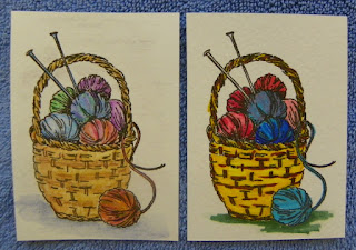
Watercolor pencils used on the left, my first attempt at Copics on the right
It took a while to find a Copic instructor anywhere near me, and even after locating a store that occasionally had a class, time after time the class was canceled because not enough people had enrolled. Finally I had a class and while pleasant, it sure didn't give me an inkling of what could really be achieved with Copics.

Another teacher was found but unfortunately, the woman had no teaching skills and I seriously doubt she was adept at working with Copics or other mediums. I was on the fence about Copic markers. By then I had a modest investment in markers as each class had required me to purchase colors I didn't yet own. By chance I discovered a store 45 minutes away that brought in a teacher once a month to teach Copic techniques. One class and I was hooked!

If you like Halloween, which I do, these images are moderately cute, but there isn't anything special about how they were colored. There is no shading and does this grouping say anything to you? They are just monster heads (no shoulders on Frankie or the ghost) stuck together. Ho hum. This was one of the classes at the nearby store. That teacher is long gone.
The last class from that store produced this. I'm not sure what to say about it. It was a small canvas board that was given to us with the background words and flowers already stamped on it. Because the instructor didn't center the images when she stamped them, she had us add the bow on the left. How could she not attempt to center the image?!!
One month later, after finding Amy (Vanilla Arts), these were done in a morning and afternoon class. The object of the women in the pool was learning different skin tones, their nuances and how to shade them. We also dealt with making clothing and inner tubes vary in color without overwhelming the image with a dozen dominant colors. Other fine points were how to make at least one of the inner tubes shiny and how to give the watery background an affect reminiscent of pool water.
If that wasn't enough to wow the caps off my markers, in the afternoon class we worked on metal finishes and how to make the fur trim on their hats look fuzzy. Both of these lessons also had us adding design touches that weren't part of the original stamps, such as the stripes and squiggles on the bathing suits, the stars on the front inner tube and the snowflakes on the elves' ornaments.


Now, the Rose:

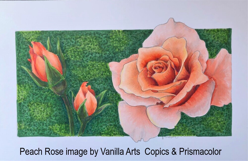
The image is not a stamp but a drawing that Amy created from photos of roses, rose buds and a background that she liked. After teaching us how to pick colors from a color photo reference, we began coloring with Copic markers. At this point, everything you see has been done with Copic markers. The background is looking very odd, right?
Here, the rest of the background has been done and it still looks.....odd.
Prismacolor pencils are beginning to work some magic on the rose.  
More pencil work on the roses, buds and stems and now I'm going dotty, but that is a good thing. Pointillism means lots of dots. Lots and lots of them!
 More shades of green dots. I think this was the third pass across the image making dots. 
 And still more dots, along with lightly done scribbles on the background. 
 Maybe the last bits of detail, maybe not. Fresh eyes tomorrow will tell me whether or not I'm done. 

A woman sneered at the mention of art done with markers. Do I look like I care what she thinks?

(Image of Tina Fey found through Google search)


If you are interested in learning how to work with Copics and Prismacolor pencils and live within driving distance of Macomb, Michigan, live classes are taught at Remember When? Scrapbooking. For details on classes or to investigate taking online classes with Amy, click here, for Vanilla Arts.

As for me, I plan to continue to use Copic markers while I get back into watercolors, explore scrapbooking, knit, sew, continue to make cards and any other creative outlet I choose. I will probably never use Copics without enhancing the almost finished piece with Prismacolor pencils. I've come a long way since shoulder-less Frankenstein.