Monday, March 28, 2016

'Twas the day after Easter...

'Twas the day after Easter
and isn't it funny
my deadline is gone
for making a bunny

The Easter decor is packed
in boxes and a bin
Now what to put out?
Let creating begin!

(apologies to Clement Clarke Moore)

Here is a view of my Easter table. That's a lot of candy for someone on Weight Watchers!
Sweeter than the chocolates are these guys, each made from Stampin' Up's Owl Builder Punch
The color above is a little off, this next view is truer. I attached each bunny to a piece of white cardstock and added the message before placing them on the dinner plates.
Here's a pile of jelly beans that are completely calorie free. The image was drawn by Amy of Vanilla Arts and colored with Copic markers and Prismacolor pencils.  
When I began this blog, I wasn't going to post photos of my grandchildren. I can't seem to resist though. I'm avoiding mentioning names so that they can't be found on search engines. Here is my 6 year old Prince of Sweetness and his 10 month sister, the Princess of Sparkle.

Friday, March 18, 2016

Art Impressions Slider Card

I'm a fan of cute and Art Impressions fits that description with many of their designs. One of their newest lines is called Stackers and they made a slider die to work with these designs. No explanation came on the die package or the stamp set. This isn't difficult to figure out but I've been doing this kind of thing for quite a while. Measurements and hints would have been helpful. Perhaps I can help someone reading this.

Here is the slider die, one of the Stacker stamps and my stamped image, colored with Copic markers.
The slider die cuts this piece and scores the fold lines. The finished size of the folded slider is 5" tall by 2" wide.
The panel that slides over your image needs to longer than 5" so that you will have a pull tab, and slightly more narrow than 2" wide for ease of movement. I cut it just barely shy of 2" the first time around and shaved off another sliver after testing it for fit.
This will the be the side facing the card recipient

This is the underside where you will apply adhesive

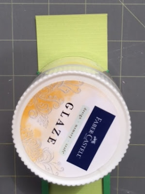
To create the pull tab, I went all high tech. I looked for a round object to trace.
 Cutting on that pencil line gave me this. It is now turned the way it will appear on the card.
Sorry about the weird shadows. We have beautiful sunlight streaming in the window of my craft room but objects outside and sun catchers on the inside made for some odd images.
How did that green slider magically turn brown?? I decided I didn't like that shade of green for this project.
New slider, ready to go in brown with that bright, light green panel. 
On the standard A2 card in light beige, I added a white mat (5.25" x 4"), then the green printed paper (5" x 3.75") and then had to decide how to cut my stamped image. Because of stamping it rather low in the corner of my paper before coloring, I didn't have a way of centering the stack vertically ro fit this space. I decided to cut it the same height as the green paper, 5" tall. I was concerned that adhering those narrow flaps of the slider housing would be difficult if I cut the stack of turtles exactly 2" wide. I opted to go wider and leave a white border around the brown part of the slider when attached.
I used narrow Scor-tape on the flaps. 
Getting this in place was a bit tricky as all of the sticky tape was exposed as I tried to line this up. You can see a bit of a bulge in how the brown lies on the card. I used a textured paper because I liked the shade of brown. I think the original green (thinner cardstock) may have been easier, but this works fine and is good for my first card.
The stamped greeting is part of the Turtle Stackers set. 
I considered punching or cutting a window in the green sliding mechanism so that the top turtle would show at all times, but I think I will leave it as is. I can always do that later.
I have two more sets of Stacker images. I think I will stamp them in such a way that I can use that piece of paper as the entire card front, and will cut a mat to fit beneath it and something to one or both sides if I want to add color in the way the green paper does here. That would make lining up the slider mechanism easier. Another option to try would be gluing it in place before the stamped image is on the card and trimming away the excess paper before that assembly is finished. The former sounds easier to me. 

Thursday, March 17, 2016

Copic and Prismacolor Rose

First, some background:

When I was given my first Copic markers I had no idea what to do with them. Coloring on watercolor paper was certainly NOT the right way to use them!
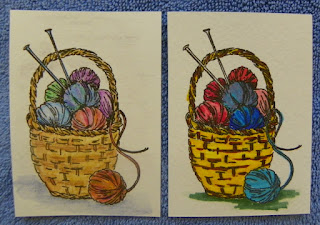
Watercolor pencils used on the left, my first attempt at Copics on the right
It took a while to find a Copic instructor anywhere near me, and even after locating a store that occasionally had a class, time after time the class was canceled because not enough people had enrolled. Finally I had a class and while pleasant, it sure didn't give me an inkling of what could really be achieved with Copics.

Another teacher was found but unfortunately, the woman had no teaching skills and I seriously doubt she was adept at working with Copics or other mediums. I was on the fence about Copic markers. By then I had a modest investment in markers as each class had required me to purchase colors I didn't yet own. By chance I discovered a store 45 minutes away that brought in a teacher once a month to teach Copic techniques. One class and I was hooked!

If you like Halloween, which I do, these images are moderately cute, but there isn't anything special about how they were colored. There is no shading and does this grouping say anything to you? They are just monster heads (no shoulders on Frankie or the ghost) stuck together. Ho hum. This was one of the classes at the nearby store. That teacher is long gone.
The last class from that store produced this. I'm not sure what to say about it. It was a small canvas board that was given to us with the background words and flowers already stamped on it. Because the instructor didn't center the images when she stamped them, she had us add the bow on the left. How could she not attempt to center the image?!!
One month later, after finding Amy (Vanilla Arts), these were done in a morning and afternoon class. The object of the women in the pool was learning different skin tones, their nuances and how to shade them. We also dealt with making clothing and inner tubes vary in color without overwhelming the image with a dozen dominant colors. Other fine points were how to make at least one of the inner tubes shiny and how to give the watery background an affect reminiscent of pool water.
If that wasn't enough to wow the caps off my markers, in the afternoon class we worked on metal finishes and how to make the fur trim on their hats look fuzzy. Both of these lessons also had us adding design touches that weren't part of the original stamps, such as the stripes and squiggles on the bathing suits, the stars on the front inner tube and the snowflakes on the elves' ornaments.


Now, the Rose:

The image is not a stamp but a drawing that Amy created from photos of roses, rose buds and a background that she liked. After teaching us how to pick colors from a color photo reference, we began coloring with Copic markers. At this point, everything you see has been done with Copic markers. The background is looking very odd, right?
Here, the rest of the background has been done and it still looks.....odd.
Prismacolor pencils are beginning to work some magic on the rose.  
More pencil work on the roses, buds and stems and now I'm going dotty, but that is a good thing. Pointillism means lots of dots. Lots and lots of them!
 More shades of green dots. I think this was the third pass across the image making dots. 
 And still more dots, along with lightly done scribbles on the background. 
 Maybe the last bits of detail, maybe not. Fresh eyes tomorrow will tell me whether or not I'm done. 

A woman sneered at the mention of art done with markers. Do I look like I care what she thinks?
(Image of Tina Fey found through Google search)


If you are interested in learning how to work with Copics and Prismacolor pencils and live within driving distance of Macomb, Michigan, live classes are taught at Remember When? Scrapbooking. For details on classes or to investigate taking online classes with Amy, click here, for Vanilla Arts.

As for me, I plan to continue to use Copic markers while I get back into watercolors, explore scrapbooking, knit, sew, continue to make cards and any other creative outlet I choose. I will probably never use Copics without enhancing the almost finished piece with Prismacolor pencils. I've come a long way since shoulder-less Frankenstein.
         

Saturday, March 12, 2016

Bunny Twila

I was not aware of the stamp company C. C. Designs until Amy from Vanilla Arts used her in Copic Club at Remember When? Scrapbooking in Macomb Township, MI.

We colored two identical images which isn't something we normally do in class. The reason for this is that getting a good blend on complexions is best done wet into wet. Typically in class, we color something, wait and watch Amy, then go onto the next step. The second time we colored Twila's face we worked without pause. The differences aren't as noticeable in this photo as they are in person. The image on the left is okay but the one on the right has a much nicer complexion.


I can't say enough good things about taking classes. The stamp is the little girl by herself. The circle behind her was Amy's addition. Would I use that all the time? No, but what about a card that needs a little something more than just this cute girl on it? Drawing the circle and coloring it is much easier for most of us than fussy cutting the girl to adhere onto colored paper. That white line around Twila is another thing I wouldn't have thought to do on my own. Not only did we learn how to do this (what material to use) but how this can be helpful and where it became a popular art form.

Many Copic technique classes teach three consecutive colors in their blends. That is fine in some things but if you want more realism, learning how to shade with a base coat of a color that isn't simply a darker shade than your object is important. The bunny pajamas (costume?) have texture thanks to a very simple technique. Much of what I learn in Copic classes carry over into other mediums that I enjoy. If it isn't a technique itself, it is how I look at things. The world is full of color and texture that we take for granted in a rush to get through our day. When you stop and really look at things, the detail is amazing.

Most of us tend to look at the same product lines over and over, be it stamps, authors we like to read, or clothes we like to wear. Beyond some of the techniques we used in this project that had nothing to do with this specific image, I never would have seen Roberta's Rascals (Twila is one of them) in the C. C. Designs line.

I have favorite stamp companies but am not limited to buying only them. Could I have lived a happy life without the above image? Sure, but I think Twila with a few changes in complexion, hair and eye color is going to be a cute likeness to my granddaughter. I've already made a list of stamps for Shannon, the owner of Remember When? Scrapbooking, to order for me. Twila and Henry (from the same product line) can represent my grandchildren in things I make for them.

Cards from experiments and online examples

This anniversary card went from okay to horrible to Hey-I-like-this. The stamped image is from Stampin' Up's Rose Wonder stamp set. I stamped three images onto watercolor paper and proceeded to play with Brusho. See Sandy Allnock's description here for what these watercolor pigments are and how they are used.  One attempt had a great background but I went way too dark on the rose and lost detail. The next attempt would have shown you that adding more details and layers doesn't always work. You need to decide when to stop and I didn't...but that is okay. Experimenting is learning.

I began by wetting an area, such as the rose petals and sprinkling on powdered pigments. Most often I only chose one Brusho color but because they contain a mix of colors within each bottle, how they react to wet paper makes splotchy but great surprises. If I had mixed the powder with water in a cup or on a silicone mat, it would have become one blended color as you would get straight from a tube, crayon or bottle.
I had the leaves and rose done when I applied water to the background for the blue splatters. Some of the petals and leaves weren't dry so the blue pigments mixed with the colors already there. That was fine with me.  Once the rose was completely dry, I mixed up some of the red pigment and redefined the petal edges. I'm not thrilled with the hard lines but don't hate it. The background still needed something but I didn't want anything heavy so I did a mist of color, holding the image in a carton while I sprayed a color over it. I believe I used Pale Ale by Memories Mist which might have been discontinued.

Switching mediums, I colored this image The Chicks Who Couldn't Even by Stampingbella, using Copic markers.

This next one is taken directly from Sandy Allnock using Avery Elle's Hello Chum stamp set. 
 
After a few days of looking at it, I decided it needed more blue and more blending in the water and also some small fish. The stamp set does have fish stamps but I had already assembled this car on dimensionals so I drew them on with a Copic multiliner. Sorry about how different the color looks in the second photo. Indoor lighting is not my friend.


Birthday cards

March madness continues. Not the basketball kind, the birthday kind. Some haven't been sent or handed to recipients yet but here are some that I can now post.

Sometimes the paper does all the work, as in this card with a Star Wars theme. I haven't seen the latest movie and wasn't sure if the character I used inside the card was a good guy or not. After researching this, he was, so I cut an opening where his face had been and stuck my grandson's image behind it.  

Star Wars is big everywhere, including on the Disney Cruise.
My grandson got two cards this year, one on his actual birthday (below) and the first one will given at his party tomorrow with extended family and school pals.  When I found the Star Wars scrapbook themed pages, I also bought stickers. I used most of the paper in pairs of scrapbook pages about the trip, but had more than enough left over to make more cards. 

This box card was the first time I used the box card die from The Stamps of Life.  I've been making this type of card for a while. They aren't difficult to make without the die but it sure does save time.I made the belly band to hold the flaps together. 
This is the back side of the box. The long white panel is where I later wrote his birthday greetings.
 Multiple views of the open box with stickers mounted on black paper.