Tuesday, January 30, 2018

Am I a Geek? Nerd? How about Organized?

Is there a difference between geeks and nerds? I googled that question and found this information from "Are You a Geek or a Nerd? The Difference Really Is in the Data" by Laurie Vazquez. Purple text below are quotes from that article found here.

The words "nerd" and "geek" are often used interchangeably, as if they mean the same thing. They actually don't.
  • geek - An enthusiast of a particular topic or field. Geeks are “collection” oriented, gathering facts and mementos related to their subject of interest. They are obsessed with the newest, coolest, trendiest things that their subject has to offer.
  • nerd - A studious intellectual, although again of a particular topic or field. Nerds are “achievement” oriented, and focus their efforts on acquiring knowledge and skill over trivia and memorabilia

  • Confused? I am.  The article goes on to say that collections are geeky, academic fields are nerdy. Toys are geeky but Sudoku is nerdy.  I'm still confused and without a label. I am geeky about my collection of stamps, dies, embossing folders and all things related to paper arts (not mentioning other crafts today) and nerdy about organizing them in databases. Also, I play Sudoku daily. 

    I have a lot of supplies. My problem was not that I couldn't find a particular stamp set made by Lawn Fawn that I knew I owned.  My problem came when planning a card or other paper craft that would possibly use more than one set. I had a binder with small photos of my stamp sets for inventory purposes, but sometimes the image was so small, I couldn't read some of the phrases on the stamps. My other problem is that sometimes I see a stamp or die that I really like and I sit on the fence. Do I really need it? I go back and forth, often deciding I don't but maybe I relent when a new reason arises why I need it . I still may talk myself out of it. That isn't the problem, it is when I unexpectedly find it in a store (especially if on sale!) and can't remember if I bought it and haven't used it yet or did I talk myself out of it again? My previous storage system and inventory lists weren't anything available on my phone.
    Thanks to Pinterest, I am now using Evernote. The Basic version is free which is a big plus if you are interested in trying this out. Here is a link to one woman's blog about using Evernote for her craft supplies.  Evernote is for whatever you want to organize and have notes, reminders and much more than I am even aware of at the moment.

    There are many written examples of people using Evernote as well as YouTube clips. I am really impressed. I come from a background of using Access, a database program that used to automatically be included in Microsoft Office Suites but databases have fallen by the wayside I guess. It cost me much more to get the software that included Access the last time I had to purchase Office.

    I feel better about things when I'm organized. You might look at my desk or craft room and find that hard to believe when a project is underway, but there is an underlying structure to my mess. It works for me. If you want keep an inventory of products or ideas, maybe Evernote will work for you.


    Thursday, January 18, 2018

    Simple folds show off fun paper

    A paper crafter often has paper that coordinates well with other patterns and colors but might be too busy a pattern for their typical card designs. In my opinion, this card design is perfectly suited for fun papers. Two Stampin' Up sites give directions for this with only slight variations in where they scored their base cardstock. Check these sites for cutting and scoring dimensions: Dawn's Stamping Thoughts  and Connie's Simply Simple Stamping

    In my card, the papers are all from Stampin' Up. The Stamps are My Favorite Things Soda Pop stamp set. The pop bottle, straw and bottle label are from Die-Namic's Soda Pop Bottles. This card went together very quickly.

    I used a scalloped circle punch on gray cardstock under the yellow lemon and red Happy Birthday circles. I was going for a bottle cap look but don't think it quite looked like that. The bottle die embosses the panels (for lack of a better word) and I went over them with a clear glaze pen to highlight them.


    Saturday, January 13, 2018

    Whale, look at this, Knitting and Card making!

    A wonderful young woman is expecting her first child in March. Today was her baby shower. Her nursery colors are white, turquoise and gray with whales as the theme. I wanted to knit a baby blanket with whales, but I didn't want to do color work with strands of yarn floating across the back that might catch little fingers and toes.

    I searched Ravelry for whale images and found this site, Down Cloverlaine  The link takes you directly to the whale that I used, but check her sidebar for all the wonderful designs she shares at no cost.

    I used Encore yarn by Plymouth because it is easy to launder. My finished project was 42" long by 33" wide. I used  just over one skein of gray (garter stitch),  a little less than one skein of the dark turquoise (pattern adapted from chart), and just under three full skeins of white. The first photo shows the full blanket on top of a beige coverlet. I had steamed it and let it dry overnight.
     The colors are more accurate in the photo below
     Close-ups of the whales

    The card that accompanied the afghan has a gray mat, water cut freehand with marker added to the back wave,  a white background embossed by using Stampin' Up's Decorative Dots, and a whale stamped from Stamps of Life's Whale2Stamp.

    Tuesday, January 9, 2018

    Image Editing and Facebook Cover Photos

    I don't know what has happened behind the scenes at Facebook, but I can no longer resize an image for a Facebook Cover Photo and have it appear as intended.  I thought the pixel size for the image was supposed to be 851 x 315 but that doesn't work well now, and the latest info I've found for display size was 820 x 312 but the original photo needs to be at least 399 x 150.

    Confused? Me too. No matter how I resized an image, only the middle of that image would appear as a cover photo. I could slide it left to ride, but not up and down. I do most of my writing and all of this kind of editing on my PC. I realize that images on mobile devices often appear different and that is beyond my help. What I'm about to share here is simply my trial and error results.

    To those who already know how to resize, add text, etc and just want to know what I did to make the image work on Facebook, go down to the Red Line and read below that point.

    I use this Online Image Editor to get started.  First I choose an image from my computer to resize. The steps for this are:
    Choose File, (select your image and open it on your computer) then Upload
    The size of this is 1024px X 768px which is way too big. My monitor isn't even showing the whole photo. I am going to crop and resize this photo.

    From the toolbar on the site, choose Crop and a box outlined in red will appear. Drag those edges to select what will become your new image.
    When you are done with the crop, hit Apply. It is probably a good idea to save this image until you feel confident with future steps. There is a Save icon on the left side of the website. Using that will save your image to your Download file on your computer. I right click on the image instead and use Save As to place the image in a file of my choosing.
    Now the image needs to be resized, possibly with a title or greeting added and maybe even a border.
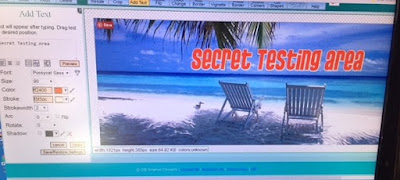
    First I will add a title. Click on the Add Text tab. This is what I see when I click on it.
    The dialog box under Add Text is where I will add the title "Secret Testing Area"
    There is the new title but it needs to be moved into place. Drag it wherever you would like it. Play with changing the color, the size of the font, and the look of various fonts. You can also add an outline to the letters by choosing a Stroke color and a Stokewidth. Arc the text, rotating it and adding shadows are all options too.
    Plain red text
     Red with a white stroke
     And finally green with a darker green stroke in a font called Rubius
    I'm still not seeing the whole width of this image because it is currently 1021px wide. I am going to resize this image to 820 wide.

    Click on the Resize tab. My cropped image is currently 1021 x 385. The Aspect Ratio designation is checked so the image will be resized accoringly.
    After entering 820 for the width, the Aspect Ratio chose 385 for the height. You can uncheck that box and enter your choice of height. The sliding button to resize the image works and will show you numbers as you move it back and forth.


    Now is the time for an embarrassing admission and a reminder to everyone. A few paragraphs back I said it would be a good idea to save your work as you go along. I did not do that this morning because I know what I'm doing and merrily went along until I had a power glitch and lost my work.


    Here is my recreated image, now a different size because it wasn't cropped exactly the same. I am going to add borders and then resize it before attempting to use it on Facebook.
    Adding borders is simply a matter of choosing that tab, picking a color and a border width. Below, the image has a green border of 5 in width. For contrast, here is a deep pink, size 7 next to it as a second border. If you want multiple borders, you must hit Apply after each selection.
    I did not apply the pink border. I used an aqua border of 3 next and the final border is a darker green. To find shades different than the ones automatically offered, click on the color swatch to see more.
     This is SAVED and will be resized to 820 x 312.
    Here is how that image appears on Facebook. So much for using the advised dimensions.

    ⸻⸻⸻⸻⸻⸻⸻⸻⸻⸻⸻⸻⸻⸻⸻⸻

    I wish I could give you precise directions at this point but the sizing seems to be hit and miss.  If you are already have the Online Image Editor open, make sure you have saved your image and delete it on that site. This clears the site so that you can move to the next step. You are now going to create a canvas for your Facebook Cover Photo. 

    Select Create Canvas. I entered the suggested width and height for Facebook Cover images and choose white as the fill color.
    This is what you will see
    Now you will choose the Wizard tab and select Overlay Image
    Choose your image from your computer and upload it.  It isn't clear in this photo, but the image is not confined to the canvas at this point, it is to the left and avove the canvas dimensions. 
    To see it better, here it is against a yellow canvas.
    Back to the white background, I moved the image into the center of the canvas and used the sliding bar on the left to resize the image. There isn't a formula for this that I've found. I guessed that this might work and saved it as Test 1. The program saves canvases as a .png file. 
    Here is how it looked on Facebook. I was really close, just part of the multiple borders on the right side were cut off. If I hadn't used borders, this would have been fine as is.
    For my second attempt, I made the image smaller using the scroll bar and eyeballed centering it. I saved this as Test 2 and consider it useable.


    Friday, January 5, 2018

    Christmas gift card and cash presentations

    I don't like to stick cash or check inside a card without some sort of holder.

    One of my sons called one evening to ask what I was doing. I told him I was drafting a box. After he made sure he heard correctly, he didn't question what I had said because this didn't surprise him. I like challenges.
    Sometimes.
    If you are giving someone a single piece of currency (or 2-3) or a single check, you don't need much wiggle room in designing a presentation container. In this case, I had some cash and a multiple page letter to enclose.

    I measured the length and height of the largest piece. To simply matters here, let's say it was just under 6" long and 2" high, meaning a sheet of paper 6"x2" would cover the image with a bit of ease on all sides. Again to make this easy, let's say the depth of the stack of items was just und 1/2". One-half inch of paper would cover the depth of the stacked items with a little wiggle room.

    Here is the box that I drafted. There is a front and back panel to the cash holder plus a flap (cover) that will come over the front. The depth of the box is 1/2", therefore 1/2" is added to each side of the 6" we measured above and also 1/2" between the front, back and cover. The overall dimensions of the paper used for this are 7" x 7". It was scored on one side at 1/2" and 6.5". In the other direction, it was scored at 2", 2.5", 4.5", and 5". 
    The cover doesn't need sides so I cut those off represented by the xxxx. The bottom of the box, the next 1/2" section should show a second set of red cut lines. This will allow you to form neat corners when gluing the sides of your box together. I used double sided tape to make mine. The cover does not have to be 2" tall if you don't want the flap to come all the way down to the bottom of the closed box.

    I made a belly band to keep the box closed. The die cut images on the belly band (measure around the closed box and allow a slight overlap for gluing together) are from Simon Says Stamp's Picture Book series of dies. I'm sorry the picture is of better quality. It was the only one I took before delivering these gifts. I used a corner rounder on the flap which is barely visible on the right hand side.

    My nieces' children got these self-closing boxes with cash and candy in them. There are many versions of directions for these boxes described online. I used these directions from Dawn Griffith. I only covered the larger triangle with designer paper. The gingerbread men are from a Stampin' Up punch called Cookie Cutter Builder #140396.

    Making these boxes was rather addictive. I made them in other sizes and will definitely make them again for other occasions. There is something fascinating about them closing so well without anything needed to seal them or hold them together.

    Next is the last thing I plan to show that relates to Christmas of 2017 and it is a strange card for Christmas and therefore requires an explanation.

    One son was giving a gift card to someone who had been a very good friend this past year. Could I make a card for him? Sure! I asked if the recipient had any special interests, such as, did one item, animal or place always make people think of this woman? He laughed when he realized the first thing people thought of with her in mind is the poop emoji. She is a lovely woman and not someone you associate with a pile of poop, but the image makes her laugh.

    With that in mind, I created a top fold pile of poop card, then fitted a Santa hat to go over it. After doing that, I realized that the card wasn't wide enough to conceal the gift card. I wanted the poop card to fit easily inside an A2 envelope. What goes better with a pile of poop than a roll of toilet paper? Voila, the gift card holder was created to accompany the poop card.


    More 2017 Christmas cards

    I made the majority of my cards in this first style. The front of the card has a diagonal fold from a point an inch and a half from the fold that runs from the top to the bottom corner. The red card base folds down on that line to create the flap that you see in the second photo. A square of green cardstock becomes the mat behind the white paper with the stamped images. Both were colored with Copic markers. 

     Stamp set: Robins on a Branch #CL497 Wild Rose Studio


     Jolly Santa #JGS100 Woodware Clear Magic Singles

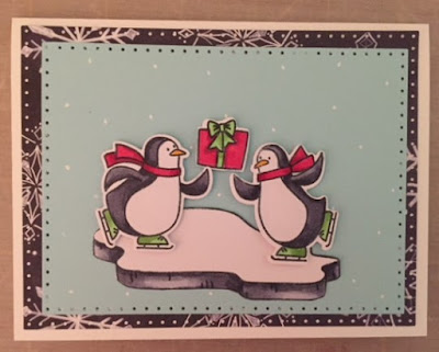
    The skating penguin card was going to have one penguin gliding using a sliding mechanism. I decided that made the card rather bulky and would probably require extra postage so I opted for slightly elevating the penguins and package on dimesionals. 

     The images and greeting are from Bring on the Joy by Avery Elle ST-17-32
    Matching dies were used to cut out the birds, gift and ice floe.

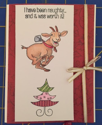
    I recently discovered that a friend has a fondness for goats. I had a cute goat stamp but it wasn't Christmas themed. This was not a problem once I combined it with another stamp set. 
    Goat is from Art Impressions' Old Goat Set AiCS37 
    Naughty message and the tree are from Clearly Besotted's Laugh Out Loud Christmas set.

    The next card was a bit more work and I only made one because of the detail in making the house resemble my own. The directions for making this card called a Raise the Roof card can be found here. The stamp set used inside on the left is Stampin' Up Holiday Home #135095 and the message on the right is from Stampendous' Wrapped Pointsettia set #CLD11.


    The last card is for a dear friend who likes flamingoes and shares my sense of humor. The flamingo is a stamp and die set from Art Impressions. The background accessories are from Stamps of Life dies.
    Art Impressions' Flamingo Wiggle #4955
    Stamps of Life die matches Islands 2 Stamp set (tree)
    The Santa hat and string of lights are from Riley & Co, Dress Up Riley Christmas #RD20