Monday, January 26, 2015

The Queen of Hearts

Just because I am normally a peace loving pacifist, don't think I've never wanted to bellow "Off with their heads!"

Thanks to the monthly art classes I attend and Penny Black stamps, I now have my own version of the Queen of Hearts. My instructor came up with the color palette that we used and drew the card that became the backdrop for our images.
The hearts on the card, the heart on her scepter and her monocle have Glossy Accents on them, making them 3-dimensional. I used a clear jelly roll pen on the hearts of her clothing. That affect is more subtle and does not show in the photos. The queen is slightly elevated from the card by pop dots.
I wasn't sure how I was going to use the queen. I love how she turned out and wanted her to hang around the house permanently, so a greeting card wasn't going to be her final destination. After fussy cutting the queen, I didn't want her on a surface where she was likely to be damaged so I opted for a shadow box frame. I mounted the card image on the papers as shown with the red measuring 5x7 inches, the size of the frame I would use.
I didn't think about the ledge inside the shadow box frame which completely covered the red paper. I wanted that bit of red to show, so the layers were taken apart and re-cut. Here she is in the frame.
I should have taken the glass out of the frame for the final photo but coulda, woulda, shoulda....you know how that goes. Don't be critical....don't make me raise my voice and bellow that famous command!


Saturday, January 24, 2015

D is for Doodling

I've said before that I find coloring relaxing and so is doodling. Doodling doesn't have to take place on paper despite what your parents told you when you were three and decided to decorate their walls.


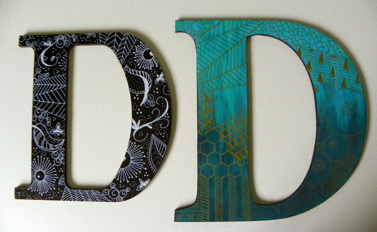
Here are two letter D shapes, both both in craft stores. The black one came already painted, the other one was made, I believe, of particle board. 
I am photographically challenged. The larger D looks better in person than in this photo. It would probably help to have sunshine entering the house for photos but alas, no sunshine in this part of Michigan today. 

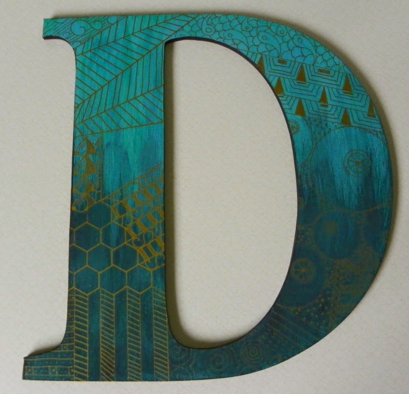
My original attempt at decorating the particle board D was to draw on it with a Sharpie oil based marker and then add stain over the drawing. There wasn't much contrast after drawing the first few lines with the marker. The particle board was more porous than I had anticipated. I based coated the entire letter with white acrylic paint and let it dry.

I used a blend of acrylic paints that I had on hand to create the background colors. There is turquoise, teal, a deep blue and even dark grey in the mix. I didn't want a perfectly smooth blend which is why you see streaks. The darker shades are at the bottom of the letter because that felt right to me. Dark = heavy, heavy = bottom. That isn't a figure analysis but I'm not posting my profile either. 

This color combo looked like my younger son's living room. I asked him if he was interested in it. He was. Would he like black or white doodling on it. Brown or gold. Huh? Those weren't options! Back to the craft store to look for extra fine tip, oil based markers in brown and gold. No luck with brown, at least not in a fine tip, so I bought a gold pen. 
I used black paint on the raw edges and on the back of the letter. I like how this turned out, and I think it will look nice in my son's house, but it isn't my favorite letter.

I like this one better, but I've always liked black and white. This one has more curved doodles in addition to those things that are rather flower-like. They remind me of a dandelion that has gone to seed. Do the designs on the other one look more masculine? I don't know. I try not to over think this. 
I have no idea where this black and white one will go yet. Can I justify redecorating a room based on this? Hmmmmmm.......

Tuesday, January 13, 2015

Gloves

Based on how long it took me to complete these gloves, you would think the pattern was difficult. It wasn't. The gloves are for me, therefore items made with a deadline, whether gifts or Christmas cards, kept interrupting this project. 
I chose this yarn for a different pair of gloves, but once I saw the Knotty pattern, I had to try this instead. The yarn is Claudia Hand Painted Yarn, an extra fine 100% Merino wool. This color is called Charlotte's  Verdigris. It has a wonderful feel to it while knitting.

I was skeptical of the detail showing up in this yarn, but it does, and a bonus is that a minor mistake is more easily lost. I don't think I have mistakes in the gloves now, but I did before reworking them. The pattern is free here  Link to Knotty Gloves pattern on Ravelry


I don't usually have trouble following charts but my mistakes occurred while misreading the pattern chart while knitting socially. I colored the chart with six different colored pencils and referred to the key and had no trouble after doing that. Without the color blocking, the symbol sequences seemed to run together, but that might just be me. I would happily use this pattern again. 

Saturday, January 10, 2015

Hanging Message Center

There are many talented Stampin' Up demonstrators who share ideas, tips and complete tutorials online. Thanks to Pinterest, I recently found Connie Stewart whose website is Simply Simple Stamping.  Each month she offers a tutorial and video for a project that is exclusive to those who place an order of $20 or more. The current month's project can be seen on the left sidebar of her site.

January's project is a Hanging Message Center. I made mine this afternoon. It is an adaptation of hers as I didn't have the same supplies that she used. It was easy to make and I think it is very cute. This will hang in my craft room.  I photographed it against dark blue paper for contrast. The yellow paper in the middle is a pad of Post-It Notes. The calendar at the bottom is within the tutorial that I downloaded from Connie after placing my order.
There are elements of hers that I prefer, but this works for me too. My flowers were cut using Sizzix Triplits dies. A simple idea from this project that I really like is the use of a small binder blip as the hanging mechanism. I ran double stick tape over a length of ribbon which I cut to fit the flat sides of the clip.

Wednesday, January 7, 2015

A box for the Jacob's Ladder card

A few days ago I made a Jacob's Ladder card shown here.  I cut some photos to fit and added a few sentiments, included the stamped and embossed Happy Birthday on the cover. The stamp is from Stampin' Up's Age Awareness set. The embossing powder/glitter is Wow's Metallic Platinum. I love the Wow line of embossing glitter.
My challenge today was how to wrap or otherwise present this. I decided to make a one piece box. I don't know if there is a term for this style of box, but I think of it as a pizza box. 

The stacked ladder is 3.5" wide, 4.25" tall and roughly .75" deep. I drew a sketch of what the open pizza box would look like. From bottom to top, there was the front depth of box, the bottom, the back depth of box, the lid, and a flap at the front of the lid. I added a little room for ease to my measurements, making the width of the box without the sides 3 5/8", the height 4 3/8" and each side became 7/8".  The flap became 1/2" which was very convenient because the bottom, top, two depths of box and the flap came to 11", meaning I could do this out of one 8.5 x 11 inch sheet of paper. I added 7/8" to the left and right sides of the 3 5/8" for a total of 5 3/8" wide. I cut the paper to that size and began scoring. 
Test box out of scrap paper
I decided to glam the black paper up a bit before creating the box. I did this before cutting and scoring, using a silver marker. 
Using the figures and doing a little math, I scored the 11" length of paper at 7/8", at 5 1/4", at 6 1/8", and at 10 1/2".  Rotating the paper so that the 5 3/8" was at the top of the score board, I scored each side 7/8" from the edge.

Which way you cut flaps along the score lines is up to you. You can see in the above photo that I cut the flaps to glue behind the front depth of the box and behind the flap. In this photo, the bottom is already glued, the top is not and that partially shows the tab. I cut the edges of the lid at both front and back on the sides because I thought it looked better.
Sometimes a project will give specific dimensions for everything, other times you'll need to wing it. I hope these instructions help you figure out how to make a box for your paper craft needs.
This is the closed box with a bit of metallic wired ribbon holding the lid closed. I had a lot of fun making both the Jacob's Ladder and this box.

Monday, January 5, 2015

Jacob's Ladder card

Did you play with a flat pieces of wood or plastic, strung together with ribbon in a toy commonly called Jacob's Ladder as a kid? I did. Why was that toy so fascinating? I think it is because kids like repetitive movement. Here is a quick view of the card in action.
I used a few sources when figuring out how to do this, both in print and online. I won't claim that my version is better than anyone else's so feel free to look for other directions for Jacob's Ladder Cards or mini-scrapbook albums. Just be forewarned when searching for Jacob's Ladder without any other clarification that there is body piercing known by this term that may not be suitable viewing for everyone. 

Your squares (this is a figurative term, mine are not actually square in measure) need to have body to them. Some people use chipboard. That would have been a great choice except I decided to do this late on a Sunday night with no chip board in the house. I used multiple layers of black cardstock.  The size isn't critical, you just want something that will comfortably fit in your hand. My squares are 4.25" x 3.5". I cut a total of 18. These six are double layers of cardstock, adhered together by double stick tape. My favorite is Scor Tape (Sookwang). I also used some very narrow Wonder Tape (the red stuff) when adhering the ribbon. We'll get to that in a minute. 
I used six different black and cream prints from a paper stack that I've had for a few years, seen here. I cut the decorative paper at 4" x 3.25", cutting two of each design. One of each of these decorative papers was glued to a single layer of black cardstock, and one of each was glued to the double layers shown above. 
I used a narrow satin ribbon to hold this all together without any problem. Other sites recommended grosgrain or organdy ribbon. Sometimes the beauty of starting a project on a Sunday night is that you use what you have on hand. Based on what I read at one site, I cut three lengths of ribbon that were double the length of the combined squares. Here are six squares laid out and one length of ribbon.
On each of the six double layer squares, I marked the middle of the square where ribbon would be glued, and a line that was a half inch away from each edge in the same direction.
I confess that I goofed and forgot to photograph the first step in the ribbon process. Hopefully a few pictures down from here will show what I am about to say.

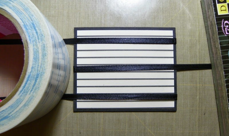
Picture the square in the above photo with glue, or in my case, Wonder tape along each of those three lines. The back side of this square already has decorative paper on it. I peeled off the tape's backing and laid the ribbons as follows:  On the top line, the ribbon's edge began on the left side of the upper tape line, ran across the square and trailed off onto the right off the square. The ribbon on the bottom line ran the same way. The ribbon in the middle began on the right edge of the square, ran along the tape line and ran off the left side of the square. One of the single layers of cardstock with decorative paper was glued on top of this. Here is what that looked like.
Here is the next double sided piece of cardstock with decorative paper added:
 
And here is the taped side where ribbon will go:
After the first panel is completed, the ribbons need to be folded over the square and head off in opposite directions. Tape and the paper pack are weighing down the ribbons in this next photo to make things easier to see.
I peeled off one piece of double sided tape at at time and brought the ribbon over the exposed tape. This is how the first piece that I forgot to photograph looked. The only difference in the original layer was raw edges of ribbon on the upper and lower left, and on the middle at the right.

It is important to keep the ribbons flat and not twisted. There should be some tension and you wrap the ribbon and adhere it, but not so much that you cause anything to buckle.
Another single layer of black cardstock with decorative paper is glued on top of the ribboned square.
Here are the first two squares attached and open like a book.
Closing the right hand page of this book analogy, the striated paper with sparkle will be on top. The steps are repeated with the remaining tiles.
  1. Cross ribbons over newly finished square
  2. Expose tape on double thickness square
  3. Keep ribbon flat, apply some tension, and adhere ribbon across the taped square
  4. Cover this with a single thickness of cardstock with decorative paper added. 
Before I show you the last step, I'm going to guess that nobody noticed what I did wrong in the beginning. In the third still photo, I showed you the squares lined up and the double length of ribbon that was cut. I had the squares oriented so that they were taller than they were wide.

In the next photo, where I showed you the lines I drew for tape placement, I changed orientation. The squares were now wider than tall.

Uh-oh....

Here us the last square waiting for ribbon placement with very little ribbon left to glue down! This wouldn't have happened if I hadn't changed orientation. 
Fortunately there seems to have been enough, plus I used more tape on the final panel than the others, hoping to be sure to secure those ribbon ends. So far, so good!
The more you play with this, the more freely the movement will occur. 

This is going to become a birthday card with a few photos and sentiments added. As long as I don't go crazy and use anything too thick, it should be fine. 

I will definitely make this again but I will probably limit color and pattern to two simple choices, especially with the goal of adding photos. If I had made each double cardstock thickness square the same, let's say plain black, and each single thickness trimmed with the dotted paper, the view in the video or in this photo would show alternating black and dotted squares. 
All in all, not bad for a Sunday night. 

Sunday, January 4, 2015

The year 2014 in review

This isn't specifically about crafting, but it is about creating. Creating me. A newer version.

January
I complained about the cold. Often. It didn't do a thing to warm things up.
I noticed that more blogs were drifting off into never, never land. I think Pinterest and Facebook take part of that blame/credit.

February
More cold. Snow fell. A lot of snow. My area of Michigan broke a record for snowfall. I began to seriously wonder if cutting Michigan off at the Indiana and Ohio border would make us a true island rather than a peninsula. The possible benefit? Maybe we could become a tropical island!

March
I began talking back to interviews on TV. Obviously the cold winter was getting to me. Thank goodness our grandson had a birthday party to brighten things up! Everyone was encouraged to dress as super heroes. Few did. How are these people my friends and relatives?  
I revealed to the world my true identity and super powers at this party:
Super Papa doesn't really have a Minion face (even though that would be soooooo cool! He is just shy. 
April
I realized that the attitude of some people was affecting my outlook. I couldn't change them, but I could change me. I stopped interacting with some people and spent more time crafting. Life got much better again. Paper crafts have been especially fun for me. Lots of cards have been made, hopefully spreading a little happiness or at least the recipients are aware that I've thought of them.

May
I only posted three times on my old blog, two of them about cards. Not a single comment was made. To be fair, I wasn't blog hopping much to generate a comment exchange.
At the end of the month, hubby, sons, my daughter-in-law, grandson and I traveled to Virginia to visit our godson's family. His parents, sister and her husband were there too. It was a wonderful family reunion. No, these people aren't relatives, but they feel like it.

June
I didn't know on May 31st that June was going to change my life. We got home from Virginia on Sunday, June 1st. Before going to bed that night, I announced, seemingly out of the blue, that I was going to Weight Watchers the next morning.
Doing that launched a new blog for me, My Long and Winding Road about my WW experience.

July
I continued to avoid negative people.
I continued to make cards and use colored pencils and Copic markers on anything that would take color.
I continued to attend WW meetings.
I continued to write about WW and post about crafting here on this blog.

August
More of the same but a new comfort level was settling in, both about food and weight loss, and crafting and why I blog. I blog for me. I've said before that this is my journal, but somehow I wanted affirmation in the form of comments. Why is that? I don't need affirmation from strangers, do I? Nice comments are wonderful, but happiness with what I am doing tells me I am doing what I meant to do.

September
Oh yeah.....I think I have my groove back! 

October
A little paint, some knitting, a lot of paper crafting and would you believe....a lot of chocolate and I still lost weight? I'm creating a whole new me. Not just a new body size, a new mind set. This is the most exciting thing I've done since producing babies!

November
Lots of paper crafts again, and some knitting. A yarn shop hop, a card making shop hop, and Thanksgiving made the month fly.

December
Like most people, I was busy getting ready for the holidays. I made a lot of Christmas cards and didn't take pictures before mailing them. 
I managed to lose weight even over the holidays, a total of 46.6 pounds between June 2nd and December 29th.

I have so much to be thankful for and so much to look forward to in 2015.
My loved ones are near me and healthy.
A new grandchild will arrive in April, a granddaughter.
Our home is our sanctuary. We are warm inside even when it is cold out in the world.
A new attitude toward food has changed my world, my health and my size. The attitude is the difference this time, a dress size or a scale reading isn't my goal.
My family makes me happy, and crafts both relax and energize me.

Life is good. Make that Good with a capital G.

 photo signature_1 3_zpspsz7c7lo.gif