I began with these stickers which I've had for quite a while in my stash. I adhered one ball and one hoop to white cardstock and cut them out. The base of this card began with an 8.5" x 11" black cardstock cut to 8.5" x 5.5", then scored to make a 4.25" x 5.5" card.
I cut a second piece of black at 4.25" x 5.5" (which was further trimmed later) and tested layout of the hoop and where the ball would arc. I marked placement of the hoop and drew an arc with a pencil.
I refined the arc a bit by tracing around a curve and freehanded a second, somewhat parallel line to make a channel for the slider. I cut this with an Xacto knife.
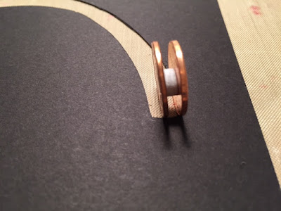
The basketball rides on two pennies with a pop dot holding the pennies together. I have a variety of sizes, brands and thicknesses of these. The term "pop dot" is used generically here, not as a particular brand. The channel needs to be slightly wider than the dot for ease of movement.
The penny assembly easily slides into the channel. The basketball on cardstock is attached with a glue dot.
I trimmed this piece to 5" by 3.75" and cut a piece of white cardstock the same size. Behind it is printed paper cut at 5.25" x 4". I held the black piece over the white and penciled Happy Birthday! in the arc.
In this photo, the white paper is glued to the basketball design paper and the letters have been traced with a black pen. I erased the pencil marks after this.
Unfortunately, I didn't photograph the back of this top piece before assembly. I used pop dots that were a bit thicker than the one used with the pennies and basketball. I placed them near the corners, mid-points between the corners and one near the center but a bit closer to the arc.
If I could set my phone's camera to video and hold it in my teeth, I could show you how freely the basketball travels that channel.If my dentist reads this, I was just kidding. I never use my teeth as tools.

On the inside of the card I used more of the basketball print under a white area for my greeting, matted onto a black rectangle. I curved the corners of the white and printed papers. Yellow post-it notes are hiding the sentiment for privacy. If it isn't clear what is in opposite corners, those are stickers of whistles that coaches use.
This went together much more easily than I expected and I really like it. It was my first slider card but won't be my last!


No comments:
Post a Comment