Monday, July 10, 2017

Birthday Card Spinner

A good friend will be receiving this birthday card today.  The print paper is from the Birthday Memories collection from Stampin' Up, as are the punches and sentiment used on the label on the front of the card. The inside greeting is from Technique Tuesday's Sassy Birthday stamp set. The oval dies are from Die-Namics (My Favorite Things die line).

This photo taken before the Happy Birthday label was added

I like the retro feel of this little girl. The above image was cut from designer paper, the reverse side of the red print. The back of the girl shown below is from the stamp set Birthday Delivery and cut with the coordinating die from the Birthday Friends set. The stamped image is not a true back side of the girl on the print paper. The stamp has her arms behind her back. Since I didn't want her to have four arms, I used markers to color the stamp rather than an ink pad, avoiding the arms. I colored this image with Prismacolor pencils because they were a better match to the print image, even though not as dark in color. I could have colored this darker but liked how this turned out and was afraid of messing up a good thing if I went over it again.


The inside of the front needed paper over it to conceal the string used to make the girl spin. I didn't get the cover piece on straight and hookey-booed (a term from my mechanic hubby) a fix by adding Washi tape as a frame.


The sentiments in the Sassy Birthday set amuse me. 


The front of the card still needed something and I hadn't said Happy Birthday yet, so I added the message below using the Classic Label and Word Window punches. The sentiment is from Teeny Tiny Wishes.


To set this card up to spin when my friend takes it out of the envelope, the suspended oval just needs to be wound up and held until the card goes into the mailer.

Home alone when taking photos, I couldn't hold the card in place and operate the camera well, but here is a clip of the girl spinning:


Saturday, July 8, 2017

Stamp woes

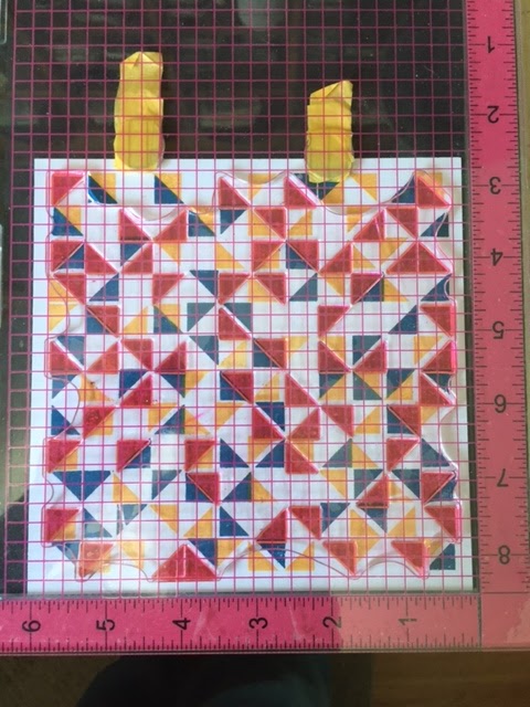
I really wanted to love the Triangle Turnabout stamp by Concord & 9th but so far, that isn't the case. The 6" stamp looks life the first view in the graphic below. Once you've stamped your paper with the first color, you rotate it and stamp again.

Update at the end of this post!

My first attempt was truly my mistake. I thought I could skip making a jig to line up the stamp on my Misti. I cannot imagine attempting to use this stamp without a Misti but even with that tool, you need to line up the stamp just so, hence the recommendation of the jig. 


Oh boy....those aren't lined up at all! 

I made the jig, lined up the stamp for placement and attempted this again with another 6x6 inch piece of paper.

The stamp is stained from the red dye used in the first attempt.

I began with blue and then used yellow. It wasn't looking too bad until you look at the upper left corner in the bottom photo below. I didn't think I had stretched the polymer stamp but that corner of the stamp wasn't completely squared up. It doesn't show in the first stamping, but successive stampings make this more evident. 


I stopped after the third color. It wasn't going to get better and something else was bothering me. See the blotch here and the line in a triangle below? That isn't user error, those are flaws in the stamp. The line is the more obvious of the two as seen in the images that follow.


On my third attempt, I taped a smaller piece of paper to the cardboard jig and turned that rather than just the cardstock. The result is better but certainly not perfect as shown in the demo videos.


My attempts certainly don't look like the examples from Concord & 9th:


I haven't given up as I do see improvement, but the flaws in the stamp really bother me and I will be contacting the company.


Lessons learned by this:
  • Don't expect perfection on the first attempt
  • Look for videos whenever a technique is new
  • Don't use Pampers Baby Wipes to clean the stamps.  I didn't mention that above but I did try to use them because they were nearby. I've used baby wipes before, just not Pampers. They made a mess. They tend to shred and leave lint. That had nothing to do with the blotch shown the stamp flaws photos. I used Lawn Fawn's Stamp Shammy after seeing the mess Pampers left. 
Update on July 12th!

I contacted Concord & 9th on July 9, explained my experience and included photos. I heard from them this morning (July 12th). They agreed it was a manufacturing problem, not user related. They asked for my address (I did not buy directly from them) and have received notification that the replacement was shipped this morning.

Mistakes will happen. How a person or company rectifies them is what is important. I am happy that I will be able to play with a new stamp in a few days and hope to improve my technique enough to share something beautiful soon. 

Saturday, July 1, 2017

Die-ing to have fun

Yes, that pun is pretty bad but for those who know me well, a bad pun is to be expected. 

My city's firework display was scheduled to happen last night but bad weather intervened. With a 24-hour delay, what was I to do?  Knit and make cards!  The current knitting project is still a work in progress and doesn't look like much in a photo yet but the cards are done.

I began with these two dies with the intention of making two anniversary cards.


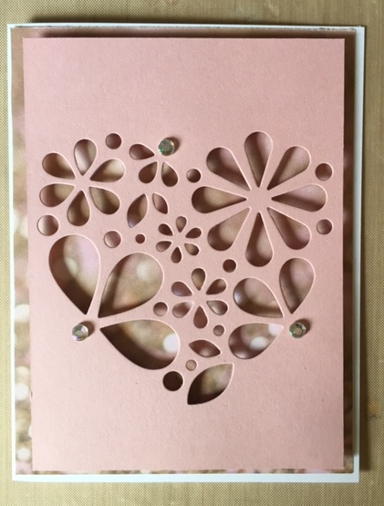
After cutting out the heart from Stampin' Up's Blushing Bride cardstock, I saved the pieces and used the cut out as a template on a plain white card.


I lightly traced the openings and used Tombow liquid glue to adhere the pink pieces on the white card. That is glue that you see in the photo below.


I used Stampin' Up designer paper from the Falling In Love collection under the pink heart. The pink cardstock is elevated by thick dimensionals and I added three crystals for a little pizzazz. 


The white card still needed something but I didn't think crystals were the answer here.


Wink of Stella to the rescue! I added clear Wink of Stella to each of the pink petals and dots and also three circles of it to the other card. Wink of Stella is subtle and hard to capture in a photo but it does look very nice when seen in person.


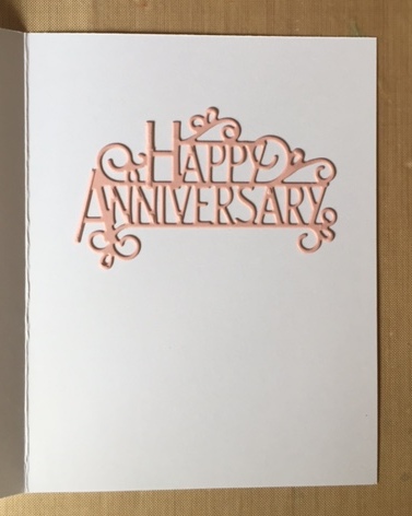
The inside greeting is the same in both cards. I used double sided tape on the designer paper for the first card and on pink for the second. I ran in through my Big Shot a few times before working with the greeting.


Remember to turn the paper over and use the die on the correct side of the paper unless you like reading your greeting backward. 


The greeting on the left is done with the designer paper, the right is plain pink.


I enjoyed making these cards. Working with the leftover pieces to create a negative image is fun and easy to achieve with liquid glue. 


Sunday, June 11, 2017

Updating my craft room clock

Long ago, I painted the face of a very inexpensive clock that had baseball stitching on it to look like this:


I wrote about this on my previous blog,  here.  The clock still works just fine and fits the space perfectly. The room that this hangs in is less of a sewing room now, more of a mixed media mess....er...craft room.

The color of the room is a deeper shade of turquoise now. Not only am I accustomed to looking at this spot to see what time it is, the clock is covering an outlet for a 220-volt line that hasn't been used in years.


After removing the buttons which were applied with hot glue, I sanded the surface but admit my sanding job was far from perfect. The clock was such an inexpensive piece of plastic, I didn't think it would hold up to vigorous sanding. If this didn't work, it wasn't going to cost me anything but my time.

I painted the face of the clock white but the rough spots were evident where some of the buttons did not remove easily. I used a product called Whipped Spackle and a few stencils to create my new clock.


The room is predominantly turquoise but has deep pink (sometimes hot pink) accents along with white and black (and all other colors if you count the supplies that are everywhere), so white, turquoise, pink and a bit of black were the colors I wanted to use.

In hindsight, I wish I had added more flowers to the face but I didn't have the window valance yet (hot pink and white stripes) and wasn't sure at this point how much pink I wanted to use. The gold on the stars and the turquoise on the bokeh effect circles were painted with Heidi Swapp Metallic Texture Paste. I used my finger to smear some on those raised images and cleaned them up with a fine paintbrush. The pink flowers were done with acrylic paint that I had on hand, and have white added to them because I felt like it. 


There was still too much white to suit me so I began dipping the end of the paintbrush handle into paints and added clusters of three dots to the background. The flower centers are black paint with gold dots on and around them.


The edge of the clock, not seen here, is black. I used a broad tip Sharpie Marker for that. The way the clock hangs, I don't think the edge is noticeable but I wanted the edge to look finished. The black dots where numerals would be are blobs of Nuvo Crystal Drops. I like Nuvo because the drops remain dimensional, they don't spread and flatten out. The reason I added the dots is that my grandchildren aren't used to clocks without reference points. They don't spend a lot of time in my craft room but the grandgirlie is only two and that may change.


I've really gotten my $2 worth out of that clock. I'm happy with this rendition.  The wooden rack in the picture below was designed to hold teacups. I'm not a big tea drinker, but I do have beautiful teacups that were my mom's and my mother-in-law's. Back in my days of smocking and belonging to a group that both smocked and did heirloom sewing, the teacups were used more often than in recent years. The cups are elsewhere now and this rack wasn't going to back in the living room but I wasn't ready to part with it. What could I do with it?

Aha!

This rack now stores ink pads stored by color family. No more digging through a drawer to find the one I'm looking for or discovering one I forgot I owned.


Saturday, June 10, 2017

Another gift of money

I give cash gifts to my great-niece and great-nephews, but never just money or a check inside a card. I hope to never run out of inspiration (thank you Pinterest!) but it is getting to be a challenge to not repeat earlier presentations. This was for my great-niece's 15th birthday. 


I wish I had taken more care with the photos and had taken step by step pictures but this blog is really for me to catalog what I've done. If someone is reading here, you can find instructions on creating flowers out of paper money online. Each flower used 3 bills. The folds were not complicated and used floral wire to hold them together and create a stem. I had all the supplies on hand and did not to visit a craft store for anything. What a shock!


The picture above really is a bad photo and I doubt it will inspire anyone but here it is anyway. I ran a thread through pink pompoms and wrapped them around the floral wire to create a more colorful bouquet. I didn't like how the wire stems looked in the clear vase (a tiny thing) so I cut strips of two shades of green tissue paper to act as leaf-like filler. The pink gingham bow is done with wired ribbon.


The card Happy Birthday was cut with a Sizzix die (#661830) available through sites that sell Sizzix dies or at The Stamps of Life. This die is a Stephanie Barnard design. 


After cutting this out of the pink card stock, I cut it again with the green and cut every other letter out to layer on top of the pink greeting. After placing it on the blue card stock, I thought it still needed something so I used a white gel pen to add asterisks randomly. The inside greeting, not shown, used the same colors as the front. 

Friday, June 2, 2017

Two Anniversary Cards with almost one die cutting

I made two anniversary cards using Stampin' Up's Rose Garden thinlits die.  My idea is not new, I've seen it many times on Pinterest and elsewhere. I'm just recording it here for my sake and to let anyone who reads this know that it was very easy to do.


I used a scrap of red that may have been Bazzill cardstock. It had a good weight to it and a bit of texture. 

Beginning with the card on the right, before tapping out the pieces from the red paper after cutting them, I placed the die on the second card front and used a pencil to draw lines within the die's openings to indicate where I would be gluing the petal pieces. The cut paper pieces were slightly larger than the pencil lines so there was no worry of lines showing and needing to be erased. I used Tombow glue, sometimes applying glue to the card, sometimes applying it to the back of the red petals. I began with the smaller pieces, tapping out just a few at a time, gluing them and repeating the process. Reading this took longer than actually doing it. 
I then switched and worked on the card on the left, gluing the rose cutout onto the card front with the same glue. The remaining piece of red card stock from the die cutting gave me that perfect outline for the red area of the card, it just needed to be squared off to match the white cardstock's dimensions. I used a tape runner to add this.

Back to the card on the right, I wanted a similar outlined edge but had very little of the red cardstock left. I placed the die on it, maximizing what I could salvage of the leftover cardstock and got the shape seen above. It wasn't perfect and I decided it looked better with a wider margin which mimicked the negative space created by the die itself. 

Despite having a lot of stamps, I don't have many with anniversary greetings. I wanted to use this label shape, also from the Rose Garden die set, but the only greeting that fit inside was this one. It is from Stamps of Life's Anniversary 2 Celebrate set. I used a Real Red stamp pad from Stampin' Up for the words and ran the side of a red Tombow marker around the edge of the die cut label. 


I'm happy to have two cards for one session of work, and like both the positive and negative looks equally well.